Case Study
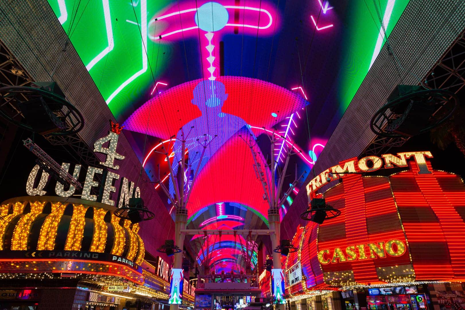
Fremont Street Experience
Clean, High-Contrast Design and Layout Improves Ad Performance
The Challenge:
Our team made creative suggestions to change the aesthetic design of traditional programmatic display and social ads that we felt appeared busy or cluttered. We suggested a cleaner design aesthetic centered around visibility and high-contrast elements that (in theory) would:
- Earn higher engagement (click-through rate)
- Drive organic traffic to the client’s website after viewing the ad
- Be more effective at revenue generation (ROAS)
However, there was no way of knowing if these design changes would deliver improved performance without creating the ads and running A/B testing against the original design and layout.

The Solution
Both programmatic and social ads were used for testing, but programmatic advertising offered more opportunities for layout variations for the different ad unit sizes. We ran four ad variations to determine which design elements performed the best.

1. UI/UX Design
Initially, variations of the Fremont Street Experience logo were tested. However, the final versions of all four tested ads kept the logo consistent. Instead, they focused on copy placement variations and different versions of the “This Could Be You” text box as the variable element.
- Our designs were based on analysis from 3M VAS (Visual Attention Software) that provides specific estimated percentages of attention on each individual design element within the first three to five seconds of initial viewing.
- We organized the placement of design elements using tested, heatmapped, science-driven marketing methods. In contrast, the original test layout arranged items simply from left to right or top to bottom.
Based on our experience and best practices, these changes would provide the best user experience and visual consumption of the design elements, ultimately encouraging users to complete the conversion goals.
2. A/B Testing
A/B testing is essential for testing variables with consistent spend and over the same period of time. These parameters limit the variables present when comparing creatives being served to different audiences. The two design themes were mirrored to test the effectiveness of copy placement, graphics, and other design elements. In effect, we compared:
- New Design vs. Original Design
- New Layout vs. Original Layout
- New Layout and Design vs. Original Layout and Design

The Results
Of the four variations tested, the ads with our design and layout outperformed the original ads.
By applying a scientific approach to the way users consume and process design elements on display and social ads, we were able to improve the performance of the ads and substantially increase overall revenue (ROAS) for the client.
- Our suggested cleaner design (both versions of layout) performed 1.8x stronger than the original “cluttered” version of the design
- Our overall suggested layout (both versions of design) performed 1.4x stronger than the original ad layout
- Our suggested versions (our layout and our design) performed 2.5x stronger than the original versions
- Version 1
- Version 2
- Version 3
- Version 4


